You are viewing a single thread.
View all comments View context
16 points
*

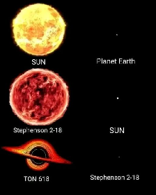
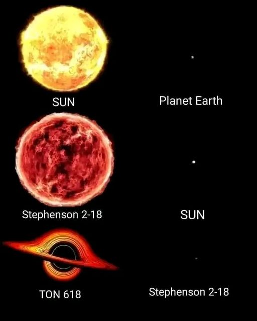
The problem is the layout.

It needs horizontal dividing lines to show that the bodies are presented in pairs at the same scale.

When you first look at it, it seems like all six are in one picture at the same scale, then you start noticing things appearing twice, and think “hang on that’s not right” and work it out, but just two lines would have solved it immediately.

Design, people! Design!

permalink
report
parent
reply
4 points

You are, of course, quite correct. And for me today, it was the meme I needed. Dealing with the US medical system, requires perspective.

permalink
report
parent
reply
6 points

No that was instantly clear to me after I read the repeating names

permalink
report
parent
reply
5 points

For you, maybe it was.

The point of good presentation and design cues is that they can make information instantly clear to almost everyone, no matter if their brain is the size of TON 618, or not.

permalink
report
parent
reply

Science Memes

!science_memes@mander.xyz

Create post

Welcome to c/science_memes @ Mander.xyz!

A place for majestic STEMLORD peacocking, as well as memes about the realities of working in a lab.


Rules

  1. Don’t throw mud. Behave like an intellectual and remember the human.
  2. Keep it rooted (on topic).
  3. No spam.
  4. Infographics welcome, get schooled.


Research Committee

Other Mander Communities

Science and Research

Biology and Life Sciences

Physical Sciences

Humanities and Social Sciences

Practical and Applied Sciences

Memes

Miscellaneous

Community stats

  • 13K

    Monthly active users

  • 2.9K

    Posts

  • 71K

    Comments