

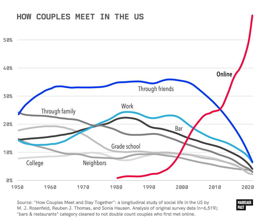
It’s been trending this way for years, but seeing it graphed out like this is shocking.
What do you think are the effects of this drastic change?
but the study they are citing doesn’t seem to confirm anywhere close to the 60% figure, it seems to be saying 11.5% instead
I think you’ve linked the variable of all couples regardless of when they got together. If 11.5% of all couples met online, whether they met in 2023 or 1975, then that doesn’t actually disprove the line graph (which could be what percentage of couples who met in that particular year met through each method).
The researchers who maintain the data set you’ve linked published an analysis of the 2017 data showing that it was approaching 40% towards the most recent relationships being formed, in 2017. I could believe that post-covid, the trends have approached 60%.
It could be that. I’m noticing now that the study I linked has a note about a sampling error they made:
Self-identified LGB adults were oversampled in HCMST 2017, and therefore remain oversampled in subsequent waves (2020, 2022). the weights (W1_WEIGHT_COMBO, W2_COMBO_WEIGHT, and W3_COMBO_WEIGHT) correct for this oversample.
So another possibility is that the data used for the graph is wrong because of a big correlation between sexual orientation and preference for online dating and it was made before this was corrected.
I don’t think the figures are intuitively implausible, mostly I’m just bothered by the apparent lack of any way to confirm the authenticity of the graph and its relationship to the source material, or get an authoritative answer to the question of how prevalent online dating is.
One reason to doubt them though, the other article I linked says that as of 2022
About half of those under 30 (53%) report having ever used a dating site or app
Which is the demographic that uses them the most. So it doesn’t make sense that more people would have met their current partner through a dating app than have ever used one.
About half of those under 30 (53%) report having ever used a dating site or app
Yes, but that’s a bigger denominator, and includes single people, and even those who have never been on a date. The headline question is what percent of couples met through different methods, not what percent of individuals, including those who are not currently in a couple.
So it doesn’t make sense that more people would have met their current partner through a dating app than have ever used one.
It could be that a higher percent of couples met online than the percent of people who have ever used online dating. If you have a data set where online dating is literally the only way to meet people, but only half of the people are trying that method, you’d have the situation where 100% of couples met online but only 50% of people have ever tried online dating (this hypothetical is purely to demonstrate the math, not claiming that this is in any way a reflection or the actual data).
It’s entirely possible (and I’d argue is likely) that the 53% who have used dating services are more likely to be in couples than the 47% who haven’t. And so that larger subset of the 47% would therefore be excluded in the “percent of couples” data.
mostly I’m just bothered by the apparent lack of any way to confirm the authenticity of the graph and its relationship to the source material
The 2019 paper I’ve linked is authored by the maintainers of the linked data set, and contains a very similar graph with an earlier cutoff (2017 data). I’m sure those authors know their data set. It’s just most of their papers using this data is paywalled, and the data is mainly used for other types of analyses.
If I have time I might be able to download the data set from a computer and just map it either naively or by applying the correct weights.
The last part doesn’t mean that. It’s 53% of the whole population under 30. Could be a higher percentage of the ones having a partner/married. Since the total is smaller if you just take the ones having a partner. Removing the ones still single/didn’t meet anyone.
Right, I get that it doesn’t strictly rule it out directly, but it’s a surprising discrepancy. That 53% is just for under 30s too:
compared with 37% of those ages 30 to 49, 20% of those 50 to 64 and 13% of those 65 and older.
while the purported figure for people having met their partner through an app is for all demographics. The number of people who are partnered vs single is 70%. If 60% of those met via dating apps, that’s 42% of the total. Which seems probably still more than the number of people who have ever tried them, and that would only check out with the absurdly generous assumption that those apps have a near perfect success rate and almost no one who uses them goes back to other methods.

