

13 points
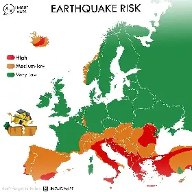
- No (scientific) sources, just advertisements for an Instagram account.
- No info on underlaying map data (OSM? …)
- What even is “Low/Medium/High Risk” in numbers? The lack of quantification is meh.
4 points
So many earthquake zones stop at national borders. From Romanian + Moldavian high risk to very low just by crossing the border into Ukraine. And a similar situation on the nw border of Germany near the low countries and in central Europe. What a nonsense map.
And this map is made even worse, because there exist readily available maps which do contain more accurate information, for example: https://www.epos-eu.org/communication/news/new-european-earthquake-risk-map-and-updated-earthquake-hazard-map-are-available

2 points
What’s with that little edge of Turkey being very low risk while the rest of the country is higher?
2 points
1 point
What constitutes high risk? A magnitude 8 or more once per year?
