

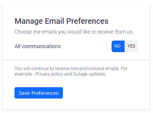
Purposefully deceitful toggle switch colours. Am I saving my preference to receive none, or to receive all? Found on clevertap.com’s mailing list service.

But one thing you need to give them is that they give you the option to opt out All in one switch and not switch 9999999 switches.

I would say it’s fairly reasonable to assume that the selected option is the blue one? If not, that’s definitely deceitful. If it is the blue one, I don’t think it’s purposefully deceitful, just badly designed. Don’t attribute to malice what can be explained by incompetence, yadda yadda
Yep. I’ve had arguments on the bird site about intuitive UI/UX. It felt like I was talking to a wall. Some devs are just that clueless.
For those saying this is probably just the devs being lazy… Well, they took the effort to write these two lines of CSS, and took the time to make sure they displayed as the exact same color.
    input:checked+.slider {
      background-color: rgba(18, 107, 255, 1);
    }

    input+.slider {
      background-color: rgba(18, 107, 255, 1);
    }
So there was effort to make both sides blue, whether that was incompetence or intentional, the design itself is still an asshole design and should be shamed :) Good toggle switches can be found all over the web in seconds!
God, I really hate toggles that make no sense.
At least that one has a label, but some are just a dark color or light one. Ok, which one is “yes”?
Would you like to receive all email communications or some email communications from us?
[ ] Sure [ ] Not now