
Are you guys tired of the “Material You” design? I don’t really like the huge paddings on everything aspect of it. Also a lot of it feels too flat. What do you guys think?

As a UI/UX designer myself (hobbyist, to be clear), I really like it.
There seems to be this notion in the homebrew/FOSS/Linux community that “wasted space” is always non-preferable. I can see this being true for some people, but I feel like a lot of people and band wagoning this opinion.
It’s pretty universally known and accepted in the design community that padding is extremely important when it comes to helping your brain read and separate content. And to be fair, most non-tech people prefer space and padding in their applications to make things easier to understand.
I can be entirely off base here, but TLDR: I like padding and it’s literally beneficial to helping your brain understand the layout of what you’re looking at better.

personal opinion, i think padding is worse for delineating objects than a bit of colour; or just, like, a line. look at this example - there are four distinct segments on the left, whereas on the right they all merge into one and a half
padding is really useful, yes, but if you put padding on everything then what’s there to be separated?

The one on the right looks like different buttons and that everything is clickable. A quick glance shows you different elements and you can easily find what you’re looking for. An example of form and function working together.
The one on the left looks like a text area showing different symbols. A quick glance shows you a blue area and a white area. Seems like you need that extra moment to find what you want because everything looks the same. An example of function over form.
Cramming a lot of things together isn’t always good (probably it’s just bad in general) because it just makes things confusing and ends up wasting time more than having bigger things but less of them.
meh, i’d say they’re obviously buttons from context (why would a calculator app just have a bunch of random unclickable symbols?). but assuming they don’t immediately read to you as buttons; md3 calc app only has 8 buttons: AC, (), %, ÷, ×, -, +, & =. the rest is just exactly the same mess of text randomly laid out edit 2023-08-03: i have now looked at this image on a better calibrated monitor. the numbers actually do have background circles (why did no-one pick me up on this). however, this does prove my point about the complete lack of any contrast on anything
having areas is good as it allows the eye to do a sort of binary search: if i want a scientific function i’ll look in the white on blue, operators in blue on white, numbers in black on white; then search for the exact button i want. without that, everything’s an unorganised mess (for instance why are brackets in the same section as operators?), with some functions hidden in the v button at the top right
also i’ve just noticed - how do the brackets work in md3? do you have to tap the button once to bring up a menu and then tap the bracket you want? or does it automatically insert one based on whether you’re inside a set? if it’s the latter, how does one do nested brackets?

Gotta agree. On the left, I’m drawn straight to the secondary set of symbols.
On the right, the “distinct segments” are more distinct to me, because of the colors. Primary symbols, All Clear(?), numpad catch me first. Then I notice the lack of shapes and color on the secondary set of symbols.
The colors are auto-generated from your phone wallpaper. Maybe choose one that is less homogenous :)

It’s nice to see your perspective on it, you make some great points.
Its funny how the places that I dislike the most (status bar toggles and recently google search) are used often and thus do not need the benefits of reading and content separation. You already know by heart what it says and where they are.
Maybe I would like it more if the big padding would only be used in places where I do not interact often with. This would make consistency difficult though.

UI dev here. To add to this, good use of “negative space / white apace” is also beneficial in signalling abundance. The more negative space you can afford to “waste”, the more resources you signal to have.
Luxury brand ads are good examples. Compare this Citizen Watch ad (https://images.app.goo.gl/mALYonDz6qzKJjuJ6) to this (https://images.app.goo.gl/sTXzyrFXNDUxR8AR9)

As a UI/UX designer myself (non-hobbyist), there’s UI and there’s UX. What differentiates a good-looking design from a crappy-looking design, most of all, is space (or padding). There are many other factors, of course, contrast being also very important for example, but space is number one. But that doesn’t make a design good, just good-looking, which is a very different thing.
Adding steps to take a common action (turn off wifi or whatever) because you used to have a certain number of buttons and now you have to hide some to add space… That’s bad design. Good looking, good UI. Shit UX.
Space should be added when needed. And you need it, when you do, to make thinks clearer. You shouldn’t add space to make it look better if that’s gonna make the experience worse.
The number one rule of design is that form follows function. You should make things as pretty as possible until you find the wall of functionality, and then you stop. Going from six quick access buttons to four was breaking that wall. You wanna be just on top of the wall. Go to one side, you get a great looking interface people hate to use. Go the other side, you get an interface that’s dense and full of things you want, but looks like a piece of nerd shit.
I’m also tired of people repeating the same copypasted ideas about any new design system out there (as I’m sure most people are when hearing people talk about their area of expertise), but they are not wrong on that regard when it comes to material you. Shit name by the way.
While you’re here, I’m curious about your opinion on the latest Spotify client design. It feels like they want to bring the desktop design closer to the touch screen client (maybe to reduce the codebase not shared by the projects). Personally, having grown up with Winamp, I find it very uncomfortable how images are dominant in both list and grid views, and how much space is left (really wasted) around texts. I think it’s just a very inefficient interface with way too much useless visual fluff.
spoiler
(the application on the left is a terminal-based client that really only needs a tiny corner on the screen)
It’s one of those “it depends” things. I’ve been working on a pretty data-dense webapp and as time goes on we’ve been shaving bits of padding off and instead relying on elevation and borders to signify the UI hierarchy of the app.
For normie apps where there’s hardly anything to present, I think all the spacing helps people not get overwhelmed as much.
Yep, it all depends on use case. If the goal of the app or site is to wade through data, then extra padding is a waste of space and should be minimized.
Also, if it’s something that you use quite a bit, then I often find the extra padding annoying as well. This is more about the user than the use case. As a user becomes more familiar with the app, extra steps (like scrolling or switching tabs) becomes less desirable than just having a jam-packed screen.

I’m not upset by it because, like all Google design eras, nearly no one uses it uniformly.
yeah, i hated material ew as soon as it was announced. so much padding everywhere, and so little contrast - to paraphrase the incredibles: if everything’s orange[1], nothing is. your eyes will adjust to it. i want actionable items to stand out, not be a slightly lighter shade of the same colour. it also looks rather like a fischer-price my first phone interface
i must say, if an app (for example, jerboa) uses material 3, i usually try to look for an alternative
[1] other colours are available, i just like orange
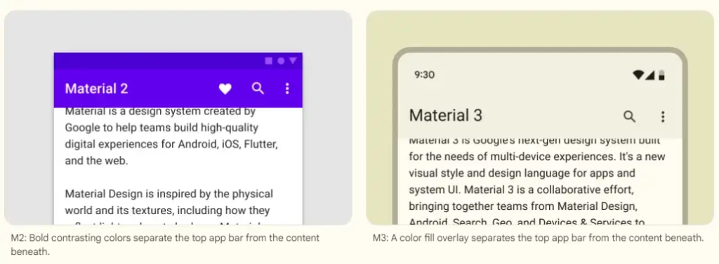
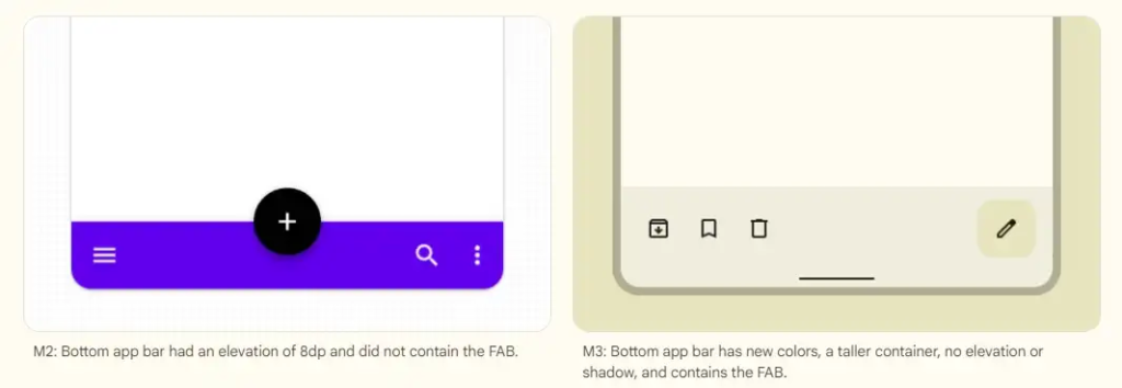
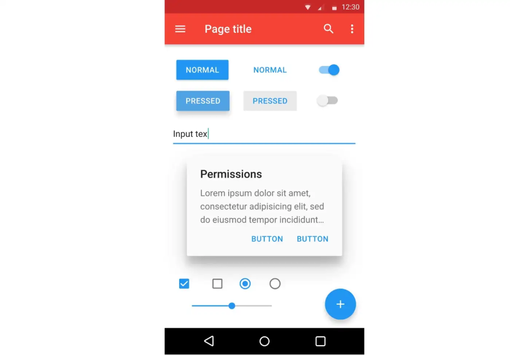
edit: some examples:
with material design, it’s clear what’s a header, what’s a footer,[2] and what each button’s state is.
with all the padding, there’s also less space; leading to less functionality
with material ew, it’s much harder to tell at a glance what each app is, one has to scrutinise the icon rather than just tell at a glance by colour
i also really dislike monet; the way it pulls this horrible washed out sickly pastel colour from a wallpaper and washes it over the entire app. if i just pulled one accent colour, and applied that to, say, the header and main action button, i’d like it a lot more
[2] look at the lack of contrast on that “new post” button
The colors I do like personally, it’s the huge buttons that make me feel like it was made for the elderly lol.
Its nice to see everyone has their own take. :)

No, not at all. I am really fond of Material You. I think it is a nice mix of modern and playful. The colors are great too. I seek out applications that adhere to the material you standards and allow for using system colors. I have a Pixel 7 and a Pixel Watch. I’m excited to see what Material You looks like on the watch when the Wear OS 4 update comes.
The dynamic colors are a fucking nightmare. No, I don’t want all my ui elements to be the same color as my girlfriend’s skin tone. And the worst is even if I change it, it resets every update. I also don’t like the new quick access controls in the pull down. This is really the first Android update that’s felt like a flat downgrade for me.


