
During the Reddit Blackout i made a graph showing the posts and comments/day (Link).
Some days ago i was asked to make an Update so here it is.
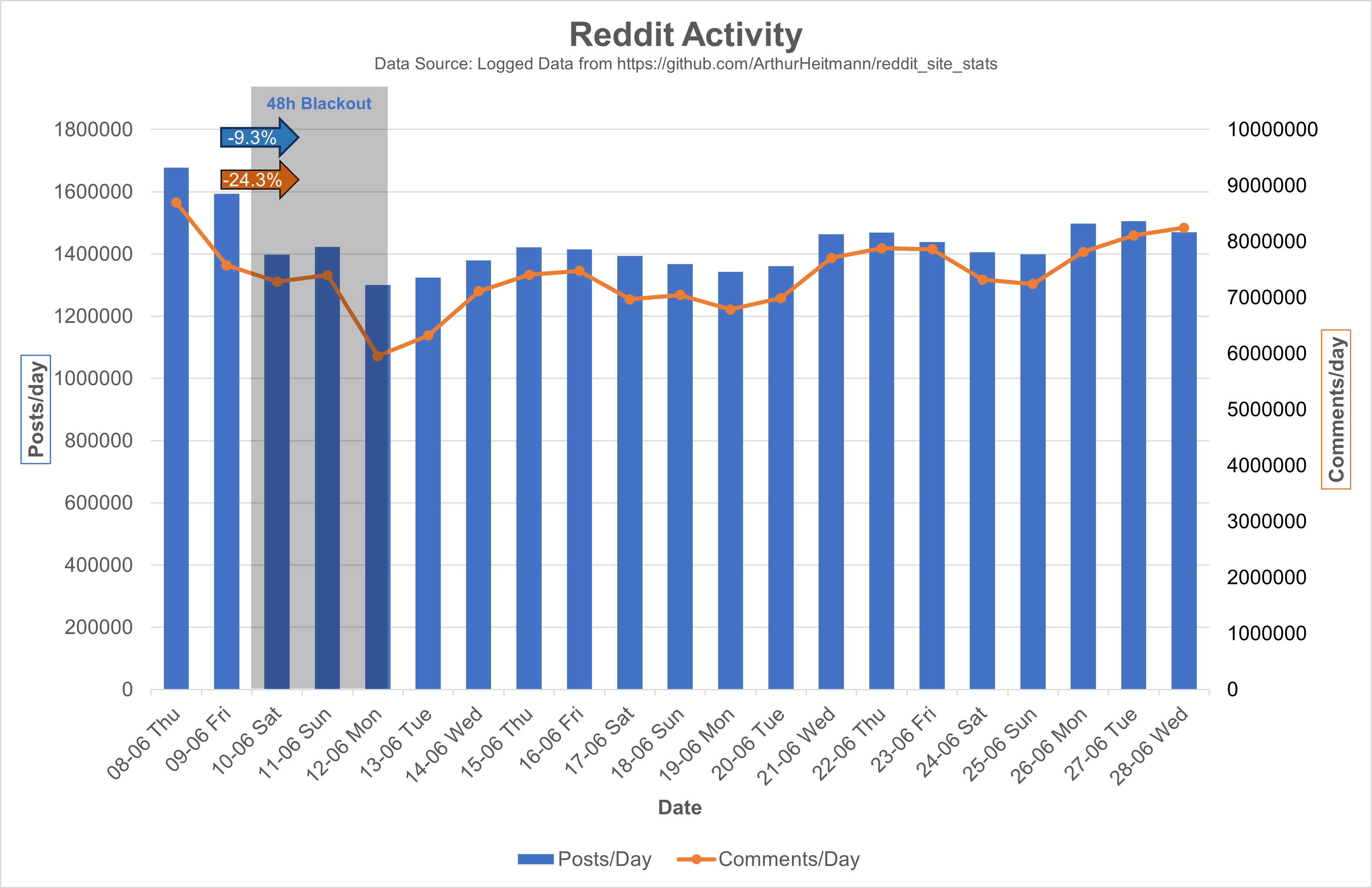
Source Data is from here and contains the same Data as some may know from here. Only difference is that the post and comment count is summed over the day.
EDIT:
The Original Post Data contained inconsistent Data points on each day (see here).
This is the corrected Chart, which uses the difference in Post IDs between the days to calculate the daily number (adjusted to s between the api calls):
I also adjusted the values to 10^6 and adjusted the y-axis ranges, I hope this makes it easier on the eyes.
For people complaining on the mixed chart: Double column looks bad with 2Y-Axis, and double lines looks too empty. 2Y-Axis are necessary cause of the difference in scaling of the posts and comments data, only other option would be an axis break.
Be interesting to see what happens between this period and over the next month. I made the switch today and I’m sure many more are doing also.

Probably worth considering that the (admittedly subjective and difficult to measure) quality of those posts and comments has likely taken a big dive.
So basically, u/Spez was right and people really are addicts. Shame, but not entirely unexpected.
I am sadly missing data reaching further back for any real comparison. It seems that Monday and Tuesday always has the highest activity, so the Blackout Effect should actually be compared to those timepoints the week before. Comparing the Thursdays for example, you still see that we haven’t reached the same activity as the week before the blackout.
But all this is just assumptions without several historic data points of the weeks before the Blackout.
I do think a huge amount of content is bot generated on the site though and I wouldn’t be surprised if spez also used ghost accounts to generate content like they admitted doing when reddit was created. Website tracker sites already said they saw a big decline in amounts and duration of user interactions of the site. Also the different protest forms did have some advertisements getting paused which is a big deal for the site. Will be interesting to see how the site value change will develop in the coming weeks and if user activity will stabilise back to normal levels or not

A better metric to check is the average amount of time spent by users on the website.
yeah some sites already do that but they don’t release the information without paying
https://techcrunch.com/2023/06/28/reddit-protest-user-engagements-site-activity-impact/
The site they used for their data is https://www.similarweb.com/
I just started these charts in the beginning since i was interested in the number per day instead of the number per minute that is reported in the original source.
Though my data seems to also be incomplete cause of missing data points.
https://lemmy.world/comment/636721
Having some trouble replying between kbin and lemmy.world right now so I am using my kbin instead


](https://lemmy.world/pictrs/image/26da7bca-cff6-4b5f-a983-22436545e922.png)