


I’m really excited to share it. Before diving into development and investing more time into this project, I would love to hear your thoughts and get some initial feedback on the app’s look.
If this concept receives enough positive interest, I plan to invest further by acquiring a domain and making it available for public use. It will be open source as well.
Thanks in advance!

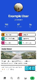
Personally I love it. It’s so different than what I normally see, and I think that’s great cause it stands out and adds value. I’m imagining a dark mode with those colors as well!
It’s eye catching because the bright primary colors are really different from what you see in a lot of apps today! I do think the pressed bookmark button is not immediately visually apparent, so I would suggest maybe making it slightly desaturated or otherwise more obviously different from the two next to it.
Don’t crop the pictures, pleeeeeease 🙏
So many of the apps do this, forcing you to click on the thumbnail to see the entire picture when scrolling. Maybe have a setting for people those that want the cleaner look.

I liked this design, Different but cute!

I love this!! It reminds me of a comic book
