

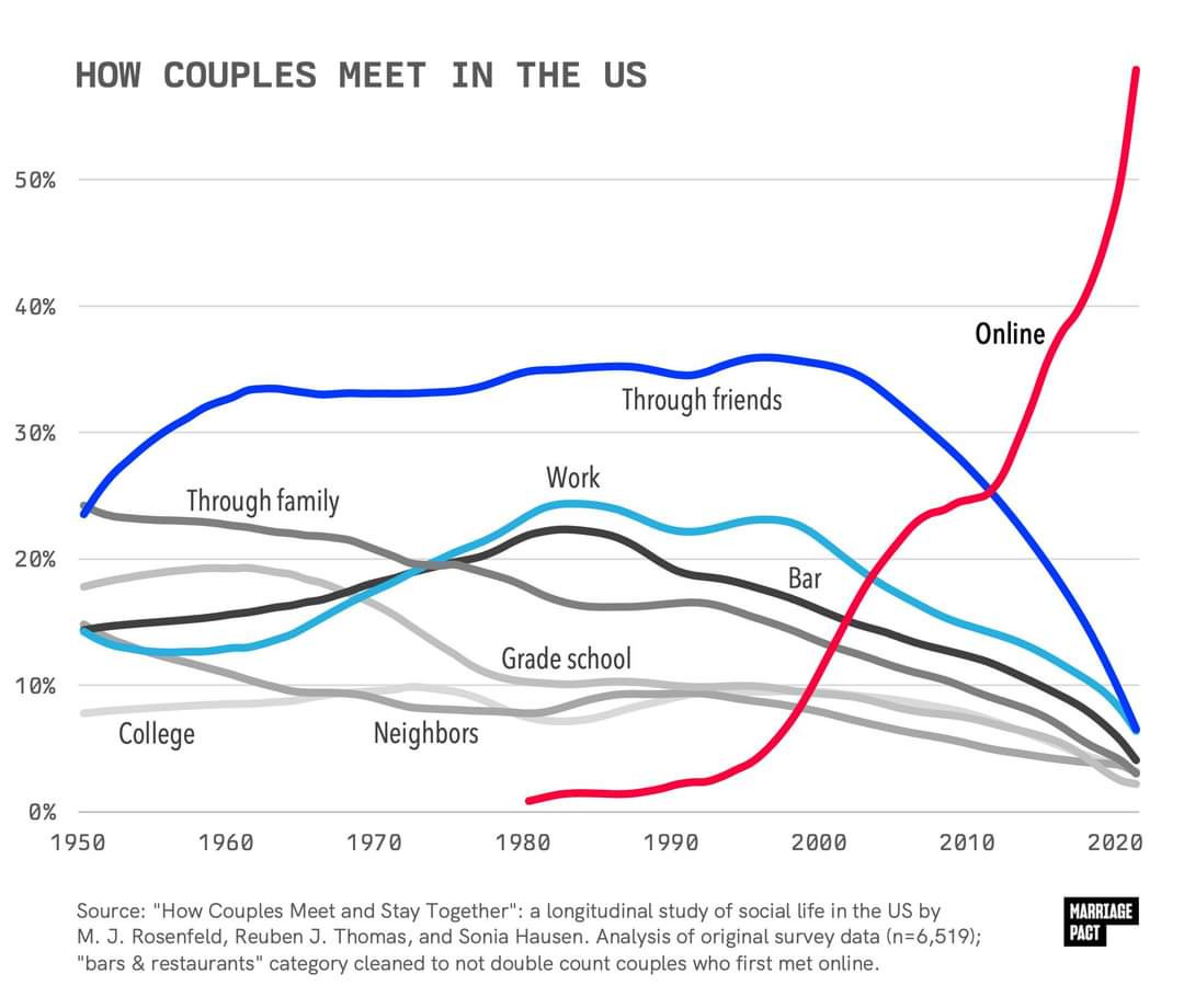
It’s been trending this way for years, but seeing it graphed out like this is shocking.
What do you think are the effects of this drastic change?
I think this graph is fake. The way the data is presented is confusing, but the study they are citing doesn’t seem to confirm anywhere close to the 60% figure, it seems to be saying 11.5% instead: https://www.icpsr.umich.edu/web/ICPSR/studies/38873/datasets/0001/variables/W1_Q24_MET_ONLINE?archive=icpsr
This lower figure also seems to line up with other studies: https://www.pewresearch.org/short-reads/2023/02/02/key-findings-about-online-dating-in-the-u-s/
One-in-ten partnered adults – meaning those who are married, living with a partner or in a committed romantic relationship – met their current significant other through a dating site or app.
The graph is branded with the logo of “Marriage Pact”, which seems to be a dating app/service targeting college students. Maybe they made it as a form of (deceptive, unethical) advertising? I don’t know, reverse image search just shows similarly unsourced social media posts, I can’t confirm anything about its origins.
but the study they are citing doesn’t seem to confirm anywhere close to the 60% figure, it seems to be saying 11.5% instead
I think you’ve linked the variable of all couples regardless of when they got together. If 11.5% of all couples met online, whether they met in 2023 or 1975, then that doesn’t actually disprove the line graph (which could be what percentage of couples who met in that particular year met through each method).
The researchers who maintain the data set you’ve linked published an analysis of the 2017 data showing that it was approaching 40% towards the most recent relationships being formed, in 2017. I could believe that post-covid, the trends have approached 60%.
It could be that. I’m noticing now that the study I linked has a note about a sampling error they made:
Self-identified LGB adults were oversampled in HCMST 2017, and therefore remain oversampled in subsequent waves (2020, 2022). the weights (W1_WEIGHT_COMBO, W2_COMBO_WEIGHT, and W3_COMBO_WEIGHT) correct for this oversample.
So another possibility is that the data used for the graph is wrong because of a big correlation between sexual orientation and preference for online dating and it was made before this was corrected.
I don’t think the figures are intuitively implausible, mostly I’m just bothered by the apparent lack of any way to confirm the authenticity of the graph and its relationship to the source material, or get an authoritative answer to the question of how prevalent online dating is.
One reason to doubt them though, the other article I linked says that as of 2022
About half of those under 30 (53%) report having ever used a dating site or app
Which is the demographic that uses them the most. So it doesn’t make sense that more people would have met their current partner through a dating app than have ever used one.
About half of those under 30 (53%) report having ever used a dating site or app
Yes, but that’s a bigger denominator, and includes single people, and even those who have never been on a date. The headline question is what percent of couples met through different methods, not what percent of individuals, including those who are not currently in a couple.
So it doesn’t make sense that more people would have met their current partner through a dating app than have ever used one.
It could be that a higher percent of couples met online than the percent of people who have ever used online dating. If you have a data set where online dating is literally the only way to meet people, but only half of the people are trying that method, you’d have the situation where 100% of couples met online but only 50% of people have ever tried online dating (this hypothetical is purely to demonstrate the math, not claiming that this is in any way a reflection or the actual data).
It’s entirely possible (and I’d argue is likely) that the 53% who have used dating services are more likely to be in couples than the 47% who haven’t. And so that larger subset of the 47% would therefore be excluded in the “percent of couples” data.
mostly I’m just bothered by the apparent lack of any way to confirm the authenticity of the graph and its relationship to the source material
The 2019 paper I’ve linked is authored by the maintainers of the linked data set, and contains a very similar graph with an earlier cutoff (2017 data). I’m sure those authors know their data set. It’s just most of their papers using this data is paywalled, and the data is mainly used for other types of analyses.
If I have time I might be able to download the data set from a computer and just map it either naively or by applying the correct weights.
The last part doesn’t mean that. It’s 53% of the whole population under 30. Could be a higher percentage of the ones having a partner/married. Since the total is smaller if you just take the ones having a partner. Removing the ones still single/didn’t meet anyone.
I think the difference is that variable is the entire population of coupled adults. Of course not 60% of all couples met online, but I’d believe 60% of couples that met this year met online.

I’d believe 60% of couples that met this year met online.
I think there’s a question of denominator, rather than percentage, involved here.
What happens when you have a pre-online standard of 100 new interactions a year in a population of 100k single-and-looking-to-mingle daters. Then you introduce dating apps, and you’ve still got the base-load 100 new interactions happening normally, but now you’ve got apps which allow you to make thousands of interactions a month rather than a hundred a year.
Now a hundred of those power-users on Grinder all start meeting up and fucking online. 100 unique combinations gets you 4950 “couples that met” in a year. Yeah, the “met up” only lasted for the duration of a naked high-five, but its points on the board!
Compare that to 100 couples that meets outside the app, but are doing it at the more stately pace of once-a-month (so, 3 times in 100 days). rather than as fast as they can swipe through the app. 300 unique “met ups” by comparison. Kinda high by historical standards but infintessimal to the ass-slapping orgy of dating the online community allows.
As someone who watches friends on these apps go on dates two or three times a week, but never settle down (because the focus of these apps is hooking up, not settling down, and the system is engineered to keep you engaged and swiping) I put forward the hypothesis that “How Couples Met” isn’t seeing a decline in non-app interactions but an enormous surge among a particular rarified group of power users milling their way through the library of potential hook-ups online.
I’d also posit that some number of these hook-ups are purely artificial (bot accounts, catfishing, onlyfans promotions, or other phony profiles) that exist purely to encourage lonely people to engage with the system and don’t actually signify human-to-human interactions. As evidence of this, I’d point you to restaurants using dating apps to dupe users into becoming customers.
(**edit: I had accidentally grabbed a graph about same-sex relationships without realizing it and have removed.)
Unclear what study that is referencing, but it’s notable that Michael Rosenfeld is also the first listed principle investigator in the study referenced in the OP, likely part of the same project, since they list updates for every few years (How Couples Meet and Stay Together (HCMST) 2017, 2020, 2022, United States). Also unclear who compiled the graph or where it was originally published. I want to reiterate that this study itself seems to very much not line up with the graph, unless I’m misreading it very badly.
The BBC article is about a book, Modern Romance, and the book makes a claim that 35% of Americans met their spouses online (“respondents who married between 2005 and 2012”). This checks out with the cited source study, which makes an identical claim, though there’s reason to be suspicious of it since it was funded by eHarmony. The scope there is a little different than “all couples”, but it’s still a very different number than what is in either this article’s graph, or in the OP graph, which are very different from each other as well (saying the number reached 70% by 2009 vs saying it reached 60% by 2020. I would think that if these graphs are genuinely based on research by Michael Rosenfeld that they would at least check out with each other.
Here’s what I think is probably going on here: people working for the marketing departments of dating apps fabricate bogus graphs, falsely attribute their source to real studies, and push them on social media to go viral. Then people writing articles like the one you linked about the subject copy paste those images without checking them, because it’s just a fluff piece for a recently published book and they don’t have much time to spend on it.
Where did you originally find the OP image?
Edit: Just noticed that the second graph is specifically about same-sex couples.
Sorry for removing the comment you just replied to. I didn’t realize I had grabbed the wrong graph from the article.
You could be right. I believe I found the original image circulating on reddit or tumblr (it was a few days ago).
I haven’t had the opportunity to read your link directly to the study yet.

This is for same sex couples which for a large variety of societal reasons likely wont reflect the dating scene among the average population, which skews heavily hetero.
That’s totally not it for me. It looks fake, but for me it was when this shit starts. A few percent got together in 1980 / early 80S?! Now I vaguely remember the 80s and the “internet” from then. I can’t imagine any got together from “online dating” then or the internet overall. Do you have a concept of what “internet” was then?


