


“works on my machine” closes ticket
galaxy brain

Meh, test in and Chrome, Firefox, use f12 to simulate other devices viewport. Done.
Fuck Safari users tho
Chrome is 63% (+ edge & Samsung as forks, makes it over 70%) of users, Safari is 20%, Firefox is 3%
Most organisations don’t want you ignoring 1 in 5 people, so unfortunately Safari testing (especially with all its shitty bugs) should be second only to Chrome for any professional work.
Also unfortunately Firefox is only 0.5% of mobile traffic, so it’s not representative of real users to only do your mobile viewport testing in that browser.

y’all do realize at least firefox has a built in function to test on different virtual devices, right?
That’s still only testing one browser, unfortunately, and especially for mobile, Firefox is a very small percentage of users
You ideally need to test Chrome, Safari & Firefox as the bare minimum, at least the latest Samsung browser is a good idea too as it’s often based on an old version of chrome. Thankfully IE has dropped off the list for most engineers now.
It allows testing on different screen sizes and orientations that match certain devices (and allows you to input custom sizes). It also gives you the option to set the User Agent string so certain styles that might be programmed into the site will trigger. However, it does not run the code in different engines. It’s still helpful, but will not show all the bugs or performance issues. For example, the way they render SVG images is slightly different. A certain image that loads quickly in chrome could potentially take longer in Firefox.
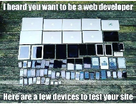
But to your point, you don’t need all the devices in the above screenshot to do testing. If you really want to do it manually, you can do so with just Firefox, Chrome, and Safari and use their respective emulators to vary the screen size.
But does it run on Nintendo DSi browser?
There are three sizes: big, medium, small.