


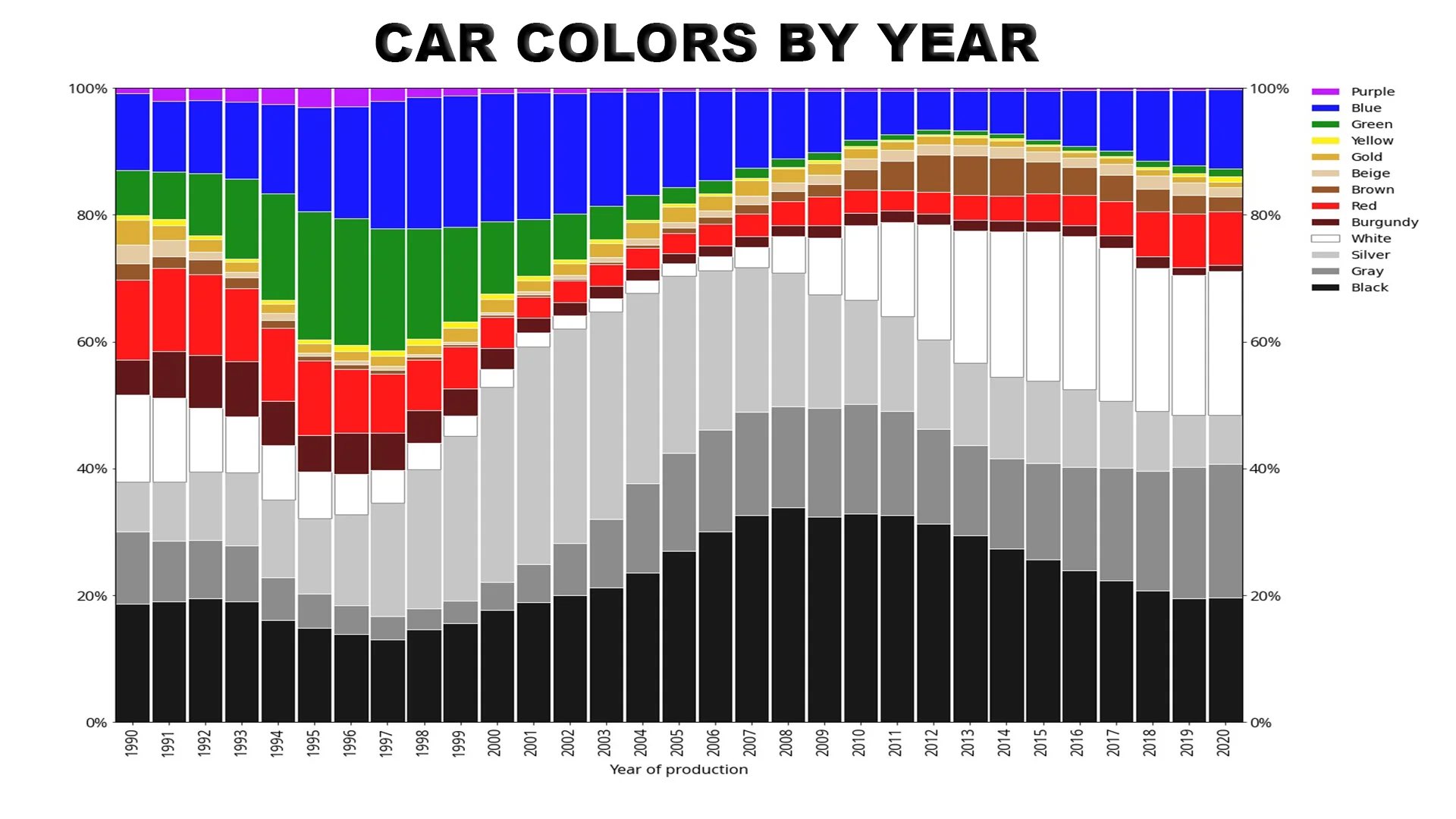
I forget what it was, something I read or watched… But there’s a link between the colours society picks for clothing, cars, etc. that correlates with society’s general mood on things. Monotones are negative or unsettled. When society is happier, it tends to go for colours
I was just thinking how one could extrapolate a whole lot about American anxiety by this chart.
https://youtu.be/Ab2u-iGN3uk?si=RHU4Zv2tdfVPpb74
I think this is the video you are referring to. And yeah I guess we been miserable as a society for the past 40 years now.

Maybe the changes in color preference, but no way color preferences alone are correlated. Some cultures just prefer more color by default, and I’m pretty certain it isn’t because they’re happier. They just have a different default. I’m sure that default can change over time too, and this chart is also probably swayed by the fact silver cars tend to resale better, so sometimes people don’t choose their preference, but make a logic based decision.
I wish this chart could stretch back into the 50s and 60s. I feel like cars were a lot more colorful back then.
A lot of guitars were painted with DuPont automotive paint back in the 50s, so if you want to know what the popular car colors were you could go check Fender, Gibson, and Gretsch’s custom paint jobs from that era.
Obviously it won’t give you the kind of data from this chart, but I like to shoehorn that little bit of trivia wherever I can. My buddy has a gorgeous surf green telecaster that is exactly the same color as the Chevy Bel Air (minus the rust spots and poorly maintained interior) he used to drive back in high school 25 years ago.

TL;DR: the graph does not account for pearls
I owned a body shop between 2003-2009. The graph is somewhat deceptive. The naughties saw a large increase in the number of pearl additives that made their way into base coats. In particular, the emergence of pearl additives that could be mixed directly into a single base color coat became available. Previously pearls existed, but they almost always required a 2 part color coat where the base color was sprayed and then a second layer was sprayed with the dry pearl mixed with a clear binder, then the 2 part urethane clear coat was applied.
Two coat systems like this behave more like an old school candy paint, AKA like a dye on top of a base color. This means any overlap error in the spray pattern amplifies the problem, and usually means the job must start over. With candies it is a much bigger challenge that is more noticeable, but it is still an issue with pearls. I could explain it in detail, but it mostly has to do with the paint “flop” or in other words how the color shifts based on the angle it is viewed from. With 2p pearls, it is entirely possible to paint a panel where the perpendicular view of a freshly painted panel matches perfectly, but the a tangential view does not match at all and is very noticeable even to the untrained eye. There are many other issues as well when it comes to repairing damage to a 2p pearls. The factory does not have many of these problems. However, the main body of the vehicle and many small parts are painted in separate operations. The potential variance in a 2p pearl means the extra parts may not match close enough even from factors as small as an ambient temperature or humidity fluctuation that alters how and where the atomized spray contacts the surface.
After the creation of many 1p pearl paints, a lot of potential color variety became possible in the bases like black white and silver. These colors are the cheapest and easiest to spray and match across batches. Consumers generally liked these varieties more as it adds just enough pop to push them into conservative color choices. These colors generally spray like a typical solid color when mixed correctly. So if I repair a small spot and limit the repair to that area, I can spray the color within a very small area and feather it out so that everything matches. Then I must clear coat the whole panel to do a proper fix, although I have hacky tricks to get around this and clear only a smaller area too.
With a 2p pearl, I would be forced to taper the base solid color all the way up to a flop angle like an adjacent panel or hard corner. Then I would need to shoot the clear binder pearl over the entire panel. Then clear coat the thing and pray that the flop matches close enough to adjacent panels.
Oh and 2p pearls can be super expensive as far as paints mostly because there are so many of them and they must be bought in a minimum quantity. If a small repair is needed, a whole bottle is required and many times that one color pearl on one model car is the only time a painter will ever use that pearl. The job may have been a $300 repair, which was $200 in supplies normally, but that bottle of pearl was $150 and your one job just forced me to carry considerably more overhead costs and a special trip to the paint jobber so your bill is now $600. This mostly went away with the 1p pearls that fit into the regular paint system like any other mixing colors. When you see super vibrant colors, with only a few exceptions, like Toyota “Raceway blue”, the vibrance is due to a 2p pearl. spoiler :::
Purple really had its heyday in '95. Seems like that was the most fun time for car colors. Now, we continue to slink into grayscale.
At least white cars are easier to cool. That’s going to be more important with EVs.
I live in Texas, and I’m shocked that cars with black exteriors AND black, LEATHER interiors exist.
Nice! What’s the source?
