


More info about it here: https://www.ghacks.net/2024/08/13/windows-11-start-menu-is-getting-a-new-layout-to-organize-your-apps/
I love how microsoft never learns their lessons.
With more room for ads, I hope?!

ha, oh look another revision no one asked for.
i had to use this recently, and its all kinds of useless now. the ‘search’ didnt find my installed app, the ‘all apps’ list is a click or two in, and then absurdly inefficiently styled… the win98 start menu was easier for me to navigate.
Nobody asks for mayor UI changes, nothing would change if you wait for that.
sometimes things that are not broken need no fixing…
unless youre some middle management pos attempting to make your mark in a terrible corporate environment
Caves are perfect, why change anything?
We have always done it like this!
All terrible arguments.
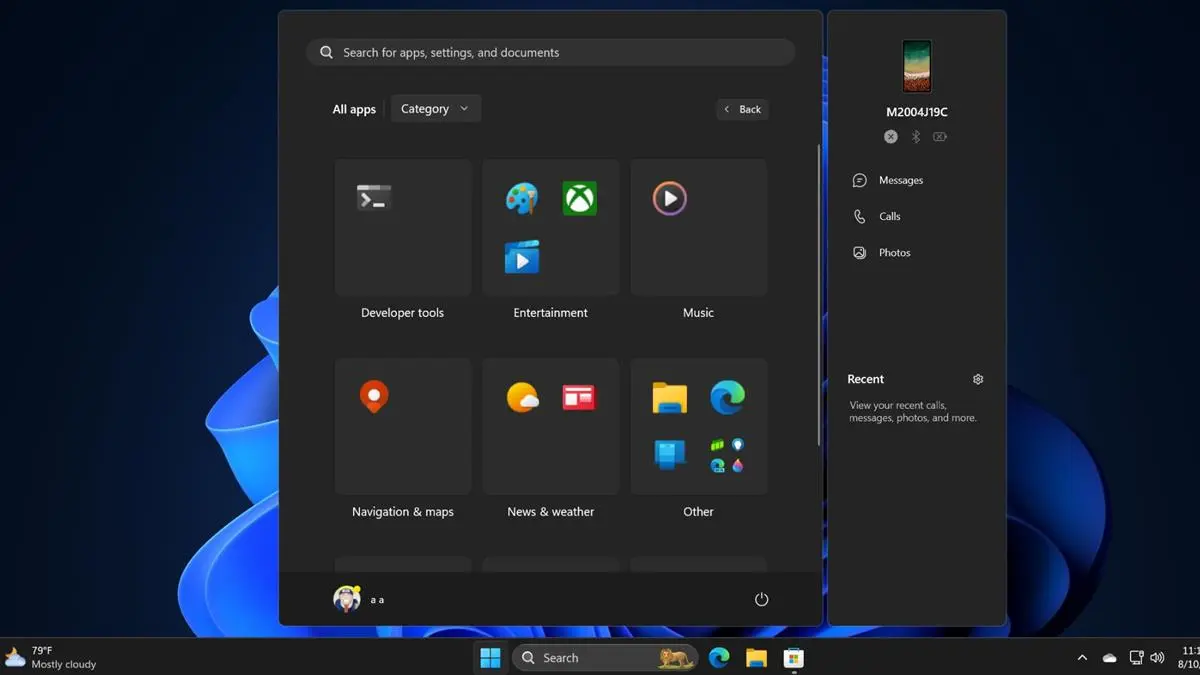
Oh cool, good to see the power button is still on the other side of the fucking menu. You know, the thing that I’m clicking on 90% of the time I’m opening the Start Menu? Why have that easily reachable like in past versions of Windows? Silly me I guess.
genuine question, why do you click that button? Why not use the physical button on the device?
Software shutdown button presser chiming in.
There’s two reasons I tend to use the software button. I know for a fact that clicking “Shut Down” will actually shut down the computer. If I press the hardware button, the computer usually is configured by default to sleep. Yes, I could change this default behaviour on all the devices I use, but then there’s the second reason:
From a psychological perspective, I tend to associate the hardware button as a “only use if system is locked up” button.
Yep, if you’re in charge of managing hundreds of computers, you don’t want to guess at what it’ll do. We have our defaults but also have people who make exceptions depending on their own work needs. Tbh, I rarely use that button anyhow though, I right click on the start menu to get that menu instead and use shutdown, restart, or log out.

This isn’t the first time Microsoft has done this, I remember this being a huge gripe for me with Windows 8/8.1
Hey that was when they thought it was also a smart idea to force that shit tablet view on users…
I didn’t mind it actually. Like I don’t mind the GNOME overview or whatever the thing that comes up when you press Meta is called
Strangly this UI always reminds me of the hospital scene from Idiocracy… Click the icon for where it hurts
Yeach the ui sucked, kinda sucked. I actually kinda liked it on 8.1 . But the one thing windows 8 did right was efficiency. I still remember my update from windows 8 to 10 when witcher 3 on my laptop went from barerly playbale to unplaybale. Sad story.

Just wait. At the rate they’re going it won’t be long before you’re forced to sit through a 30 second full screen ad in order to even open the start menu.

Win+X > U > U
Shuts down your machine with no mouse required, use U > R if you wanna restart

I just Alt + F4 from the desktop or just press the power button. I always change it to regular old shutdown.
agree on the power button change, unless you have little kids, in which case the button should just be disabled.


Another 500k lines of new code? Yay more bloat!
Looks like someone at Microsoft saw someone’s iPad and went “That’s what we need! Icons in boxes that need an extra click to be used!” and their MBA boss figures they’ll get a bonus for “increasing user engagement” by making everything take two actions instead of one now.
Sigh.

From the linked article:
One interesting thing about it is that clicking on an icon instantly launches the app, without opening the folder.


