


Salty old designer’s 2¢
I think the new icon scales much better. The fox’s head has turned, and the snoot is easier to see when it’s small / far away. Also, the tail flame is more exaggerated, and it is also more apparent at a small scale.
The globe is kind of lost now. It just feels like a random purple ball, but scaling that down allowed the designers to play up the tail flame.
All in all, I dig it. Complex gradients and shapes are not great for logos. Never has been. That stuff is hard to work with when you start putting logos on signage, fav icons, etc. Simple logos have always been more practical.
And that said, simple is very very hard to do well. It’s clear that they spent a LOT of time on every little curve and detail with this thing. I think the designer did a nice job of preserving the history while giving Mozilla’s design team something that will be easier to work with.
I know I’m completely butchering the color palette here, but I’ve finally realized what I felt was missing from the new logo. In the previous iterations, the head was always turned in such a way that you couldn’t see the eyes. Now the head is at an angle where you should see the right eye. But you don’t, the head is completely empty.
Here’s an “”““improvement””“” making the logo a bit more friendly I think:


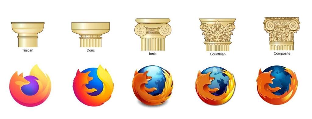
^^ imo the logos under the “Doric” and “Tuscan” pillars are my two favorites. I like the slightly more detailed one better than the flat logo, but I completely understand why they changed it and there are some way worse examples of logos getting butchered by becoming too simple.

Am I the only one who likes the new Logo? I mean its simplified but you can still clearly recognize the Red Panda. Plus I like purple

You’re not the only one, people especially in niche spheres like Linux are very nostalgic of a certain era in computing and refuse to accept that change happens. For example there are people who absolutely hate apps with the slightest bit of white space even though that was proven time and time again to be more accessible and readable

nope
Edit: Dug a bit deeper and found the answer on Firefox’s website

Wow I didn’t know that, the logo definitely looks more like a fox though…
? In the very question you linked they state without a doubt that it’s depicting a fox tho
“hi, the logo is clearly depicting a fox - however the red panda (common name: firefox) is also a cute mascot for our browser”
That means they have some red panda mascots (it seems like they use to actually have some live cams that you could watch them on too!) But the logo itself does infact depict a fox

Firefox wasn’t around during the time of the ancient greeks, silly. They used Netscape Navigator


previous logo remains superior, it’s got lovely colours and a nice balance of simplicity and detail.
the classic logos just look quaint and the current logo kinda feels… empty?
are you triyng to reignite the pillar discourse?!


