


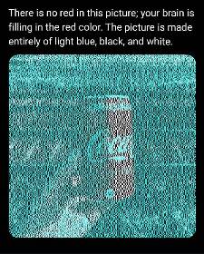
Red is complimentary to cyan.
If the cyan were switched with yellow, the can would appear blue.
Also, it’s not our brains creating the red, it’s our eyes. They get exhausted of seeing the cyan and replace it with red.


It depends on the size you are viewing it at. This works well on small screens but less well on large screens


So if the can shown wasn’t Coke, but Sprite, it would still appear red? Or is it a mix of both? The eyes are confused and the brain fills in? Like when seeing pink as mentioned elsewhere.
It’s not marketing, just colour theory. The same idea has been used by painters for ages.
It is when you use cova cola instead of, lolipop, santa, flag, flower or some other red object.

That’s so weird. You can stare at a pixel and go “yep that’s red”. Zoom in, still red. Zoom more, BOOM IT’S BLACK!
Why is my brain making the train stripes red? I don’t know what color they normally are, which I assumed was the mechanism behind the coke can illusion.
Oh weird, I assume this is just because the white is relatively red compared to the cyan, right? As in if you took any image and coloured it in the same way then it would also look red.
Yeah, there seems to be a lot more going on here than just marketing. If you mask the logo, the red still works. I believe it has to do with the combinations of white/black, white/cyan, black/cyan and the relative size of the blocks to produce a red hue through complimentary color persistence or whatever it’s called.
Brain uses expectations to decide what to fill perception with. you don’t expect hands to be the same red tone as cola cans.
I think it’s also the amount of blue overlay. If you zoom way in, the cola can has much larger chunks of uninterrupted white, whereas the hand has a lot more blue interspersed.
I think there’s something more going on here than just “marketing”. Because if you look at the tiny thumbnail in the OP it’s very clearly red, and you can even load that thumbnail into an image editor and zoom in to see slightly reddish pixels.
So something happens when scaling this image that actually results in a red hue, and I don’t think my computers image scaling algorithms are also falling for “marketing”. I would guess it’s actually some kind of sub-pixel trick that makes it seem like there’s colors there which aren’t, and that’s why the image scaling algorithms also reveal the same colors you see.

